Project overview
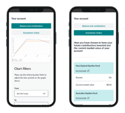
Octagon Asset Management required a client portal where their clients could log in and manage their assets. The portal needed to offer features such as viewing asset overviews, transaction history and account settings. Due to the urgency of the project, there was limited time for comprehensive user research and testing. However, leveraging insights and research from a previous project for a related group company allowed us to streamline the UX process and focus on delivering a robust and user-friendly portal within the tight deadline.
Additionally, we needed to modify the navigation bar to include a login button and create a multi-step form for the joining process. Once customers joined, they would have access to the full asset management system. The goal was to ensure that despite the time constraints, the portal would provide a seamless and intuitive user experience and consistency with the company’s brand identity.
Delivering a robust portal for clients to efficiently manage their assets.
Challenges
Time Constraint: The project had a tight deadline, limiting the scope for user research and testing.
Consistency: Ensuring the new portal was consistent with the group’s existing platforms.
User experience: Despite the time constraints, the portal needed to offer an intuitive and seamless user experience.
Navigation and accessibility: Modify the navigation bar to include a login button and creating a multi-step form with conditional logic for new users.
Approach
Leveraging existing research: Octagon Asset management is part of a larger group of companies for which we had previously conducted extensive research and testing. As we were working on a very tight deadline we utilized the insights from this existing research to inform the design and functionality of the new portal, using the information was a great advantage as it provided us with a clear understanding of necessary improvements and allowed us to implement them efficiently.
Design consistency: Incorporated branding elements and design guidelines to maintain consistency across the company’s identity. Ensured the portal design aligned with the visual and functional standards while following all accessibility guidelines.
Rapid prototyping and iteration: Working closely with the Product Owner, I received valuable guidance and information on the strict requirements for the multiform. So I began the process developing high-fidelity prototypes quickly using Figma to visualise the multiform functionality. Prototyping the multi-step form, in particular, was complex due to its conditional logic, requiring careful design and multiple iterations to ensure it functioned smoothly.
Focussed improvements: Analysed feedback from the previous project to identify areas for improvement and enhance user flows and interface elements to address any usability issues discovered. Conducted internal reviews and made iterative improvements based on feedback from stakeholders.
Conclusion
Octagon Asset Management client portal was successfully launched within the tight deadline. Leveraging existing research and focusing on rapid prototyping allowed us to deliver a high-quality product that met the client’s urgent needs. The portal received positive feedback for its ease of use and consistency with the group’s other digital platforms. The inclusion of the login button in the navigation bar and the multi-step joining process contributed to a seamless user experience.
As the portal was recently launched, we have not yet obtained enough data to begin working on improvements. We are still in the process of gathering information and feedback to inform the second phase of development. This ongoing evaluation will ensure that future updates are based on user insights and usage patterns, allowing us to further enhance the portal’s functionality and user experience.


