Project overview
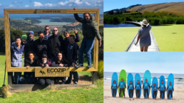
In the competitive world of recruitment, Hainesattract needed a fresh start. When I joined the team, I saw immense potential in the brand. The original branding included a logo with problematic kerning, and the brand elements weren’t cohesive, relying on a photograph featuring a flower and a “pinned” bee. Seeing an opportunity for improvement, I proposed a comprehensive rebranding to better capture the essence of Hainesattract, enhance its visual identity and better align with its core values and target audience.
Before
After
The beginning of the transformation
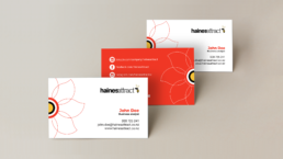
Hainesattract’s original logo had its charm but the flawed kerning made it look unbalanced. The first step in this rebranding journey was to adjust the kerning, though seemingly a small detail, was crucial. Adjusting it was like fine-tuning a musical instrument, bringing harmony and balance to the logo’s appearance. Each character now stood with the right amount of space, making the logo look polished and professional.
Embracing the bee
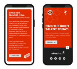
Next, it was time to make the bee, a symbol of potential candidates, a central part of Hainesattract’s identity. The bee, once part of a larger photograph, was carefully integrated into the logo. The little honey maker added a unique and fresh touch, representing how Hainesattract, attract and engages talent. The flower, now with a target at its center, symbolised Hainesattract, illustrating the agency’s focused approach in recruiting and engaging the right talent. Together, these elements made the logo not just a name but a compelling story of Hainesattract’s mission and values.
Before
After
Expanding the colour palette
To infuse more life into the brand, new colors were introduced. These colors were chosen thoughtfully, aiming to evoke feelings of trust, energy. With a richer palette, Hainesattract’s branding became more vibrant and flexible, ready to adapt to different contexts while maintaining its core identity.

Implementation plan
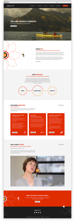
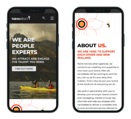
Research and planning: Conducted market research and competitive analysis to identify industry standards and user expectations. Collaborated with stakeholders to understand their vision, goals, and target audience.
UI/UX Design: Designed wireframes and prototypes to establish the website’s structure and flow.
Visual Design: Created the visual elements, using Figma, Photoshop and Illustrator to ensure a cohesive brand identity.
Content creation: Developed a content strategy that aligned with Haines’s values and messaging and produce high-quality multimedia content, including videos, case studies and interactive elements.
Testing and launch: Perform extensive testing to ensure a seamless user experience before launching the website.
Collaboration: Worked closely with two developers to ensure seamless integration of design and functionality.
Conclusion
Hainesattract’s rebranding journey reflects a strategic transformation aimed at aligning its visual identity with its core values of attracting and engaging the right talent. By integrating symbolic elements like the bee, representing potential candidates, and the flower with a target at its center, symbolising Hainesattract’s focused recruitment approach, the new logo tells a compelling story. It goes beyond mere aesthetics to embody Haines’s mission of connecting talented individuals with rewarding opportunities. This rebranding not only revitalised their image but also strengthened their brand narrative, positioning them as a trusted partner in the competitive realm of recruitment.