Project overview
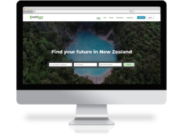
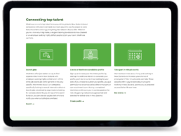
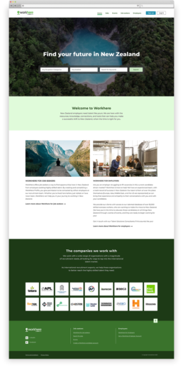
Workhere is dedicated to connecting highly skilled job seekers with New Zealand employers. The platform facilitates the process for candidates by providing a comprehensive profile creation system that allows the recruitment team to contact them. WorkHere also offers essential resources, knowledge, connections, and tools to aid in the successful transition of talent to New Zealand.
Note: The current online version of the site no longer represents what was originally designed.
Refreshing WorkHere's online identity
Goals and objectives
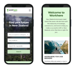
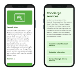
Enhance user experience (UX): Improve the usability and accessibility of the website to ensure a seamless experience for job seekers and employers. Ensure the website is fully responsive and provides an optimal experience on mobile devices.
Modernize the visual design: Update the website’s visual elements to reflect a modern, professional, and welcoming brand identity.
Content strategy: Reduce the volume of content on the website by removing redundant information that is already provided by Immigration New Zealand, focusing on essential and unique information relevant to job seekers and employers.
Increase engagement: Implement features that encourage job seekers to complete their profiles
Implementation plan
Research and analisys: Conducted user research through surveys and interviews to understand the needs and pain points of job seekers and employers. Analysed website metrics to identify areas of high drop-off and low engagement. Reviewed existing content to identify information that can be streamlined or removed.
Planing: Developed wireframes and prototypes to visualize the new site structure and layout. Mapped out a content strategy to ensure clarity, conciseness, and relevance.
Visual Design: Utilised Photoshop and Illustrator to create graphic elements an Figma for collaborative design, allowing for real-time feedback and iterations. Designed a clean and modern UI that aligns with WorkHere’s brand identit. Developed a new logo and brand collateral to reinforce the updated look and feel.
Collaboration: Worked closely with two developers to ensure seamless integration of design and functionality, ensuring responsiveness and accessibility across all devices.
Content optimisation: Worked with copywriters specialists to condense and refine the website content and ensured the remaining content was well-organized, easy to navigate, and focused on the unique value WorkHere provides.
Testing and launch: Perform extensive testing to ensure a seamless user experience before launching the website.
Feedback
The redesign of the WorkHere website successfully met the objectives of enhancing user experience, modernizing the visual design, increasing engagement from both job seekers and employers, and streamlining content. The collaborative approach, user-centered design, and thorough testing ensured the delivery of a website that effectively supports WorkHere’s mission to connect talent with opportunities in New Zealand.

